


From the NYT series of graphics on the rise and fall of ISIS, a map showing the position October 2015 to October 2017.
There are other graphics. Link:https://www.nytimes.com/interactive/...and-back.html?
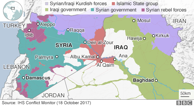
From the BBC a map showing who has what; from IHS Conflict Monitor:
Link (part of a wider article):http://www.bbc.co.uk/news/world-41679377


Bookmarks